Forum Background
-
Beardroid91
- Hot Wheels

- Posts: 4413
- Joined: Thu Nov 29, 2012 5:38 pm
- Location: Denmark
Hey i tried to fuse 4 of wallpapers together to make one big one, maybe you could try to see how it would look as the forum background.
-
Bez
- Global Mod

-
Drift King

- Posts: 6161
- Joined: Sun Feb 19, 2012 7:48 pm
- Gender: Male
- Location: The Garden of Eden
- Contact:
Will take a look at it later this week.Beardroid91 wrote: ↑Mon Jul 17, 2017 11:11 am Okay, while as it is now it works pretty well, as you see it is there but it is not drawing the eyes away from the forum window so i'm happy enough with it as it is now, but sure a slight scale down would be ideal, but i can look into it later.
-
Beardroid91
- Hot Wheels
- Posts: 4413
- Joined: Thu Nov 29, 2012 5:38 pm
- Location: Denmark
The new background has the same flaw as all the others had, it is to bright and draws to much attention, but i like the idea.
I actually grew to like the look of the wallpaper that was on before even though you can see that much of it, it just sort of worked, while this race flag clashes with the eyes big time. And as this is a dark forum then it really doesn't work to have a very bright background drawing attention away from the actually forum.
I actually grew to like the look of the wallpaper that was on before even though you can see that much of it, it just sort of worked, while this race flag clashes with the eyes big time. And as this is a dark forum then it really doesn't work to have a very bright background drawing attention away from the actually forum.
-
Bez
- Global Mod
-
Drift King
- Posts: 6161
- Joined: Sun Feb 19, 2012 7:48 pm
- Gender: Male
- Location: The Garden of Eden
- Contact:
I'm not happy with it either but I thought the last one looked too dark and depressingBeardroid91 wrote: ↑Thu Jul 20, 2017 10:20 pm The new background has the same flaw as all the others had, it is to bright and draws to much attention, but i like the idea.
I actually grew to like the look of the wallpaper that was on before even though you can see that much of it, it just sort of worked, while this race flag clashes with the eyes big time. And as this is a dark forum then it really doesn't work to have a very bright background drawing attention away from the actually forum.
This is just a temp background till I come up with something better, still not happy with all the ones so far
I just purchased a completely new style yesterday and may introduce it onto the forum at some point in the future, it will allow all members to pick how they want the forum to look.
It will have lots of user options including dark forum like this one or light forum and even one in between
However, this is a long way off as yet as i will be customising it to suit TDUDT
This is how the style we use now looked when i first bought it, as you can see i have customised it a lot.
The other downside is nobody likes change
At the moment we are well ahead of the game so no need to rush, below is a photo of a standerd phpBB forum and as you can see ours is more modern and has lots more features.
-
Beardroid91
- Hot Wheels
- Posts: 4413
- Joined: Thu Nov 29, 2012 5:38 pm
- Location: Denmark
Bezrider wrote: ↑Fri Jul 21, 2017 8:57 am I'm not happy with it either but I thought the last one looked too dark and depressing
This is just a temp background till I come up with something better, still not happy with all the ones so farsome work better than others but it's hard getting the right one.
Dark and depressing, lol it suited the forum nicely, and made the actually forum be the center of intention, while this super bright ones makes it a living hell to read anything on the forum, as they take up way to much attention and isn't pretty to look at at all.
So before you say the old is depressing look the new ones you made and installed, and then are making me depressed now, thanks for it.
Why not just a picture of a dark brick wall ?
-
Bez
- Global Mod
-
Drift King
- Posts: 6161
- Joined: Sun Feb 19, 2012 7:48 pm
- Gender: Male
- Location: The Garden of Eden
- Contact:
Ok anything for a quiet lifeBeardroid91 wrote: ↑Fri Jul 21, 2017 2:32 pmBezrider wrote: ↑Fri Jul 21, 2017 8:57 am I'm not happy with it either but I thought the last one looked too dark and depressing
This is just a temp background till I come up with something better, still not happy with all the ones so far
Dark and depressing, lol it suited the forum nicely, and made the actually forum be the center of intention, while this super bright ones makes it a living hell to read anything on the forum, as they take up way to much attention and isn't pretty to look at at all.
So before you say the old is depressing look the new ones you made and installed, and then are making me depressed now, thanks for it.
Why not just a picture of a dark brick wall ?
Have a few days off at the moment so will look into something better.
-
Beardroid91
- Hot Wheels
- Posts: 4413
- Joined: Thu Nov 29, 2012 5:38 pm
- Location: Denmark
New is even more depressing 
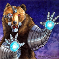
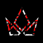
What about these ones ?


What about these ones ?
-
Beardroid91
- Hot Wheels
- Posts: 4413
- Joined: Thu Nov 29, 2012 5:38 pm
- Location: Denmark
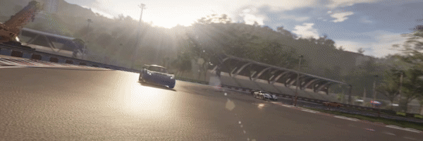
Okay, well i tried playing with the last one, just to see how it could look:


Nooooo 
Please go back to either the grey and white pictures or the brands. Those were not depressing at all and are less distracting.
Maybe it helps if you both put off your sunglasses
Please go back to either the grey and white pictures or the brands. Those were not depressing at all and are less distracting.
Maybe it helps if you both put off your sunglasses
PC Player
 TDU, GRID, Assetto Corsa, pCars, NCG, The Crew, Dirt, Forza: MadManCK
Clubs: TDU2: Luny's Fair Friends (VP-Exec), GRID AS: TDUDT (Pres) DT-Racing Team: Team Leader
TDU, GRID, Assetto Corsa, pCars, NCG, The Crew, Dirt, Forza: MadManCK
Clubs: TDU2: Luny's Fair Friends (VP-Exec), GRID AS: TDUDT (Pres) DT-Racing Team: Team Leader
 Eden Games Can Kiss My Mustang
TDU, GRID, Assetto Corsa, pCars, NCG, The Crew, Dirt, Forza: MadManCK
Clubs: TDU2: Luny's Fair Friends (VP-Exec), GRID AS: TDUDT (Pres) DT-Racing Team: Team Leader
Eden Games Can Kiss My Mustang